

AI Integration Quick Reference
AI Integration Quick Reference
Where It Fits
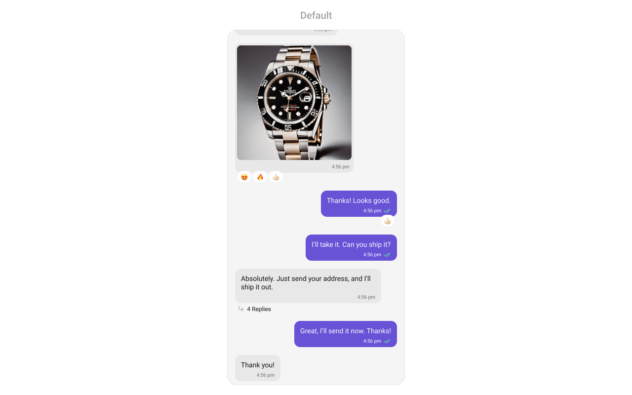
CometChatMessageList renders a scrollable, real-time message feed for a user or group conversation. Wire it alongside CometChatMessageHeader and CometChatMessageComposer to build a standard chat view.
Minimal Render
Multi-Attachment Batch Grouping
When several attachments are sent together from the composer’s staging tray, they arrive as multiple media messages — one per media kind, in the fixed order Images → Videos → Audios → Files — that all share a singlebatchId in their metadata. The message list detects consecutive messages carrying the same batchId from the same sender and renders them as one visually connected group instead of separate, independently-chromed bubbles.
Grouped chrome
Within a batch, the list renders shared chrome so the group reads as one logical message:- The avatar and sender name render once, on the first message of the batch.
- Delivery/read receipts render once, on the last message of the batch.
- Interior spacing collapses so the bubbles sit tightly, reading as a single stack.
- The caption (if any) is carried by the last message of the batch.
batchId) are unaffected.
What renders inside a batch
Each message in the batch is single-kind, so it renders the matching plural bubble — an image/video grid, a stacked audio-player list, or a connected file-card stack (see Message Bubble Styling). Recorded voice notes are never batched with files — they render their own voice-note bubble. SetenableMultipleAttachments to false (together with the same prop on the composer) to disable multi-attachment rendering.
Filtering Messages
Pass aCometChat.MessagesRequestBuilder to messageRequestBuilder. The UID/GUID parameters are always overridden internally based on the user/group prop.
The following parameters in messageRequestBuilder will always be altered inside the message list:
- UID
- GUID
- types
- categories
Actions and Events
Callback Props
onThreadRepliesPress
Fires when you press on the threaded message bubble.onError
Fires on internal errors (network failure, auth issue, SDK exception).onReactionPress
Fires when a reaction on a message bubble is clicked.onLoad
Fires when messages are successfully fetched and loaded.Global UI Events
CometChatUIEventHandler emits events subscribable from anywhere in the application. Subscribe in a useEffect and unsubscribe on cleanup.
SDK Events (Real-Time, Automatic)
The component listens to these SDK events internally. No manual attachment needed unless additional side effects are required.Pin, Save and Thread Subscription Options
These actions appear in the message options sheet, each with a prop to hide it.- TypeScript
- JavaScript
Removing asks, adding does not. Unpin and Unsave show a confirmation; Pin and Save run
immediately. The asymmetry is deliberate and shared across all CometChat UI Kits — the additive
action has its own undo one tap away, the destructive one does not.
A just-sent message may briefly refuse to pin or save. On a moderated app the server holds a new
message at
moderation.status: "pending" for a second or two and refuses with
403 ERR_MESSAGE_NO_ACCESS — the same code it returns for a genuine permission refusal. The kit
keeps the options visible and shows a transient message rather than claiming the user lacks
permission, because by the time someone opens the sheet and taps, moderation has usually finished.Custom View Slots
Each slot replaces a section of the default UI.HeaderView
Custom view above the message list.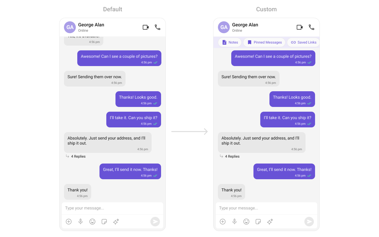
FooterView
Custom view below the message list.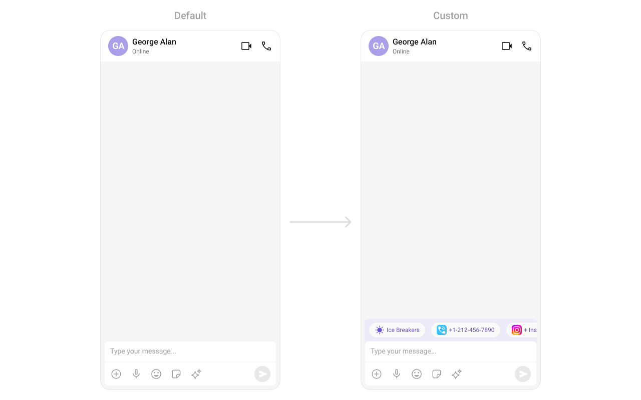
templates
Custom message bubble templates via CometChatMessageTemplate.dateSeperatorPattern
Custom format for displaying sticky date separators.datePattern
Custom format for message timestamps.textFormatters
Custom text formatters for message content.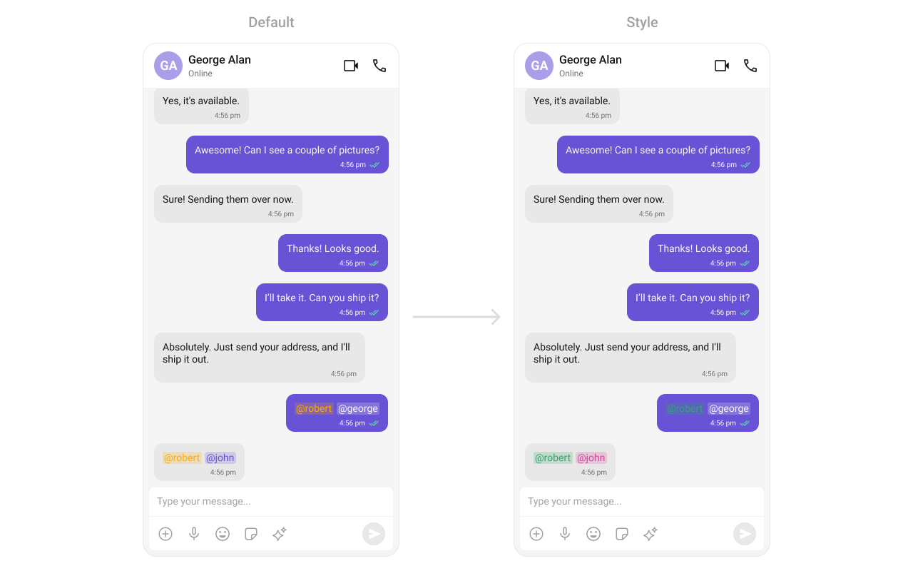
Common Patterns
Threaded message list
Hide all chrome — minimal list
Left-aligned messages
AI conversation starters
Navigate to specific message
Load last agent conversation
Resume the most recent AI agent conversation on start:Styling
The component uses the theme system fromCometChatThemeProvider. Pass a style prop to customize the appearance.
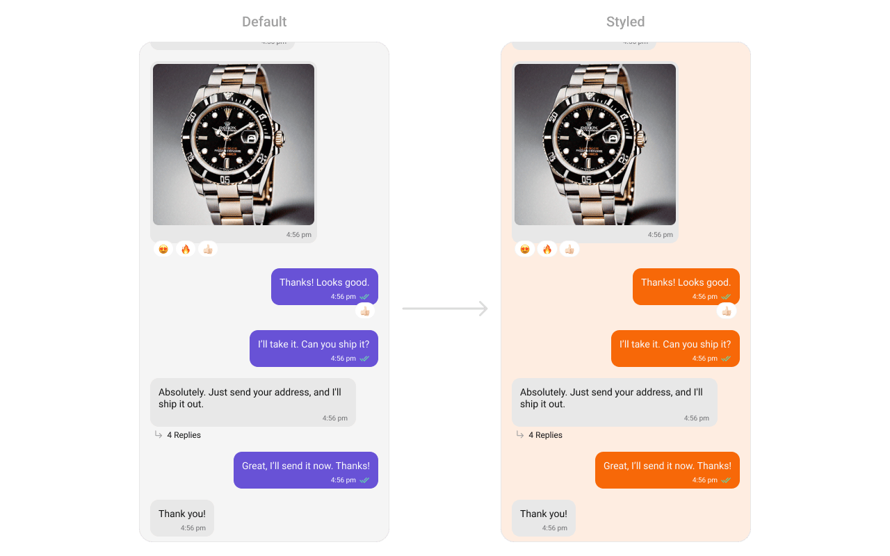
Style Properties
Props
All props are optional unless noted. Eitheruser or group is required.
alignment
Controls message alignment.avatarVisibility
Shows/hides avatars on messages.enableMultipleAttachments
Enables multi-attachment rendering: batch grouping and the plural bubbles (Images/Videos/Audios/Files, Voice Note). Setfalse (with the matching composer prop) for legacy single-attachment rendering.
customSoundForMessages
Custom sound file for incoming message notifications.datePattern
Custom function to format message timestamps.dateSeperatorPattern
Custom function to format date separator timestamps.disableSoundForMessages
Disables the notification sound for incoming messages.EmptyView
Custom component displayed when there are no messages.ErrorView
Custom component displayed when an error occurs.FooterView
Custom component displayed below the message list.goToMessageId
Scrolls to the specified message on initial load.group
The group for group conversation messages.HeaderView
Custom component displayed above the message list.hideCopyMessageOption
Hides the copy message option.hideDeleteMessageOption
Hides the delete message option.hideEditMessageOption
Hides the edit message option.hideError
Hides the error state view.hideFlagMessageOption
Hides the “Report Message” option.hideFlagRemarkField
Hides the remark text area in the flag message dialog.hideGroupActionMessages
Hides group action messages (join, leave, kick, etc.).hideMessageInfoOption
Hides the message info option.hideMessagePrivatelyOption
Hides the “Message Privately” option.hideModerationStatus
Hides the moderation status UI.hidePinMessageOption
Hides the “Pin message” option. Pin Messages must also be enabled for your app in the CometChat Dashboard before the option can appear at all.hideReactionOption
Hides the reaction option.hideReplyInThreadOption
Hides the “Reply in Thread” option.hideReplyOption
Hides the reply option.hideSaveMessageOption
Hides the “Save message” option. Save Messages must also be enabled for your app in the CometChat Dashboard before the option can appear at all.hideShareMessageOption
Hides the share message option.hideSuggestedMessages
Hides suggested messages in AI view.hideThreadSubscriptionOption
Hides the “Follow / Unfollow thread” option. Unlike pin and save,ThreadSubscriptionConfig defaults to on, so this prop is the usual way to hide it.
hideTimestamp
Hides timestamps on messages.hideUnpinMessageOption
Hides the “Unpin message” option.hideUnsaveMessageOption
Hides the “Unsave message” option.hideTranslateMessageOption
Hides the translate message option.loadLastAgentConversation
Automatically loads the most recent agent conversation when set totrue.
LoadingView
Custom component displayed during the loading state.messageRequestBuilder
Controls which messages load and in what order.
UID/GUID are always overridden internally.
NewMessageIndicatorView
Custom view for the “New Messages” indicator.onAddReactionPress
Callback fired when the “Add More Reactions” button is clicked.onEmpty
Callback fired when the message list is empty.onError
Callback fired when the component encounters an error.onLoad
Callback fired when messages are loaded.onReactionLongPress
Callback fired when a reaction is long-pressed.onReactionPress
Callback fired when a reaction is clicked.onSuggestedMessageClick
Callback fired when a suggested message is clicked.onThreadRepliesPress
Callback fired when a threaded message reply count is clicked.parentMessageId
Displays threaded conversation for the specified parent message.quickReactionList
Custom list of quick reactions.receiptsVisibility
Shows/hides read/delivery receipt indicators.scrollToBottomOnNewMessage
Auto-scrolls to bottom when new messages arrive.searchKeyword
Keyword to highlight in message text.showMarkAsUnreadOption
Shows “Mark Unread” option in message actions.startFromUnreadMessages
Loads from the first unread message if available.suggestedMessages
Predefined prompts for AI assistant chats.templates
Custom message bubble templates. Replaces all default templates.addTemplates
Additional message templates to append to the default templates.newMessageIndicatorStyle
Custom styles for the “New Messages” indicator.newMessageIndicatorText
Custom text for the “New Messages” indicator.streamingSpeed
Speed in milliseconds for AI response streaming animation.aiAssistantTools
Tool actions for AI assistant functionality.textFormatters
Custom text formatters for message content.user
The user for 1-on-1 conversation messages.Next Steps
Message Header
Display user or group details in the chat toolbar
Message Composer
Compose and send messages in a chat
Messages
Complete messaging interface with header, list, and composer
Component Styling
Customize the appearance of UI Kit components